
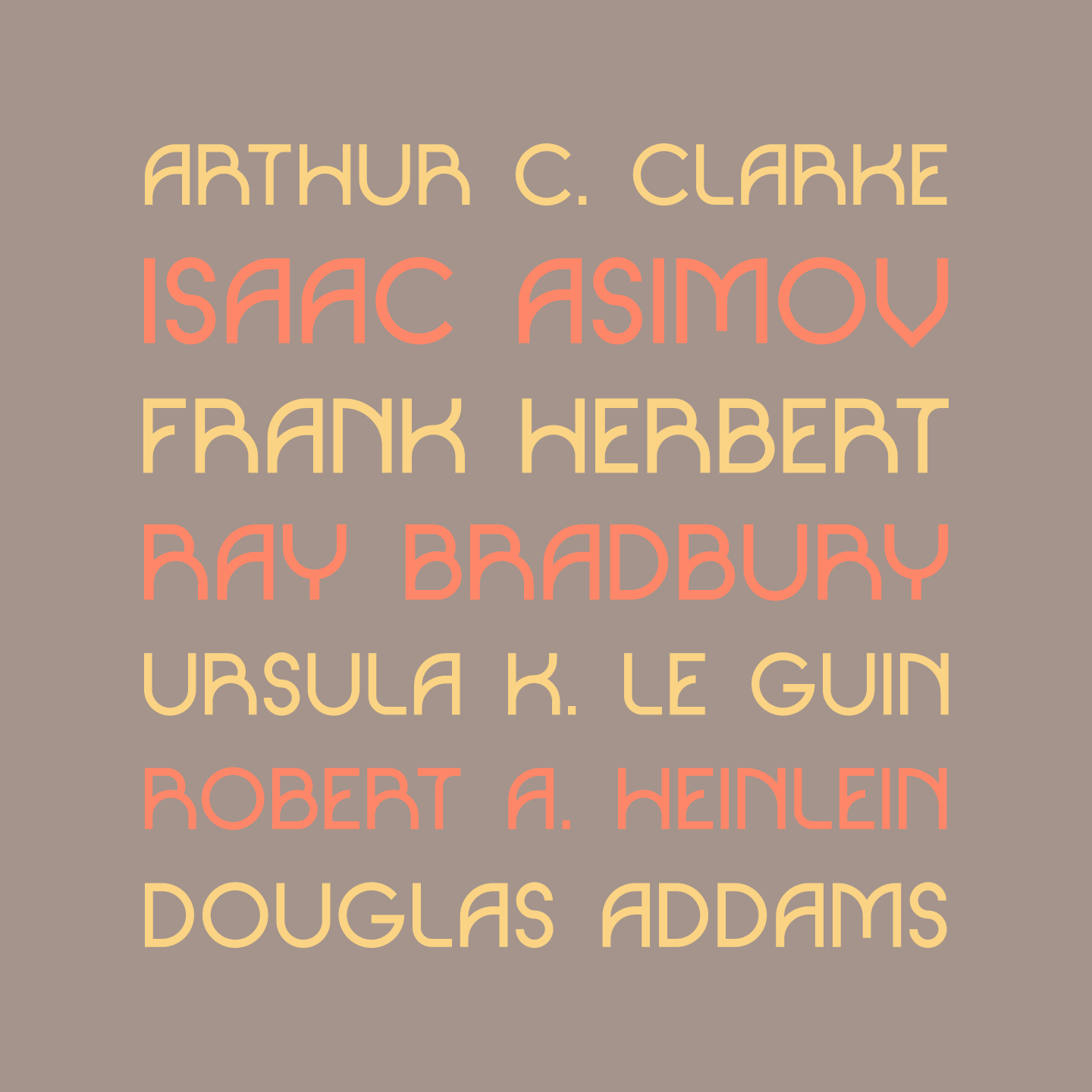


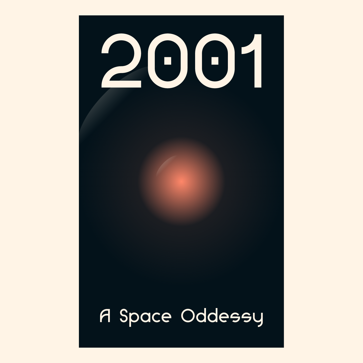


Clarke Sans
Clarke Sans is a geometric sans serif that gets its name from the writer Arthur C. Clarke. It is inspired by the style of the mid-century paperback sci-fi novels, known for their dramatic book covers.
Clarke Sans was created in conjunction with Tyler Jamieson Moulton’s senior design thesis, Anatomizing Science Fiction︎︎︎, which drew from his library of sci-fi paperbacks to create a series of information designs.
︎ Contact TJM to get Clarke Sans