

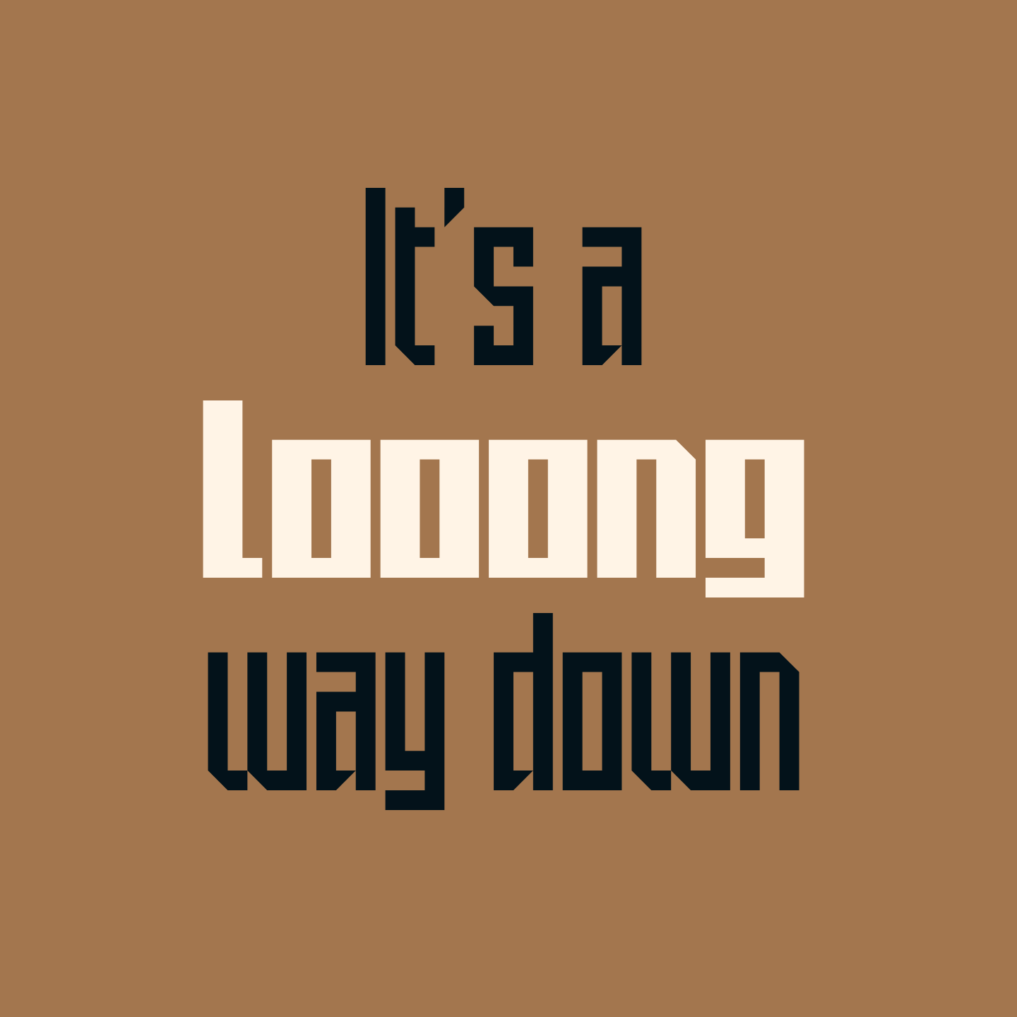


Elevator Sans
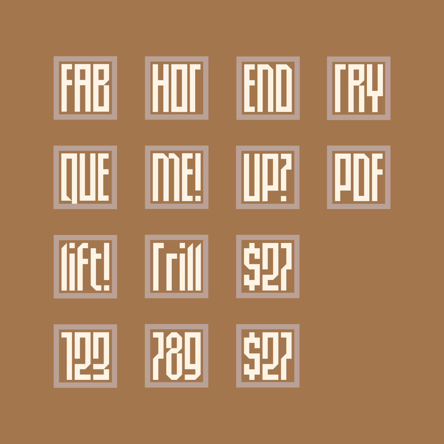
Elevator Sans began as a three character logo for an elevator company and was inspired by an elevator’s verticality and precision of design. The result is a condensed geometric display typeface great for styling long wordmarks or for locking up a few characters into a perfect square.
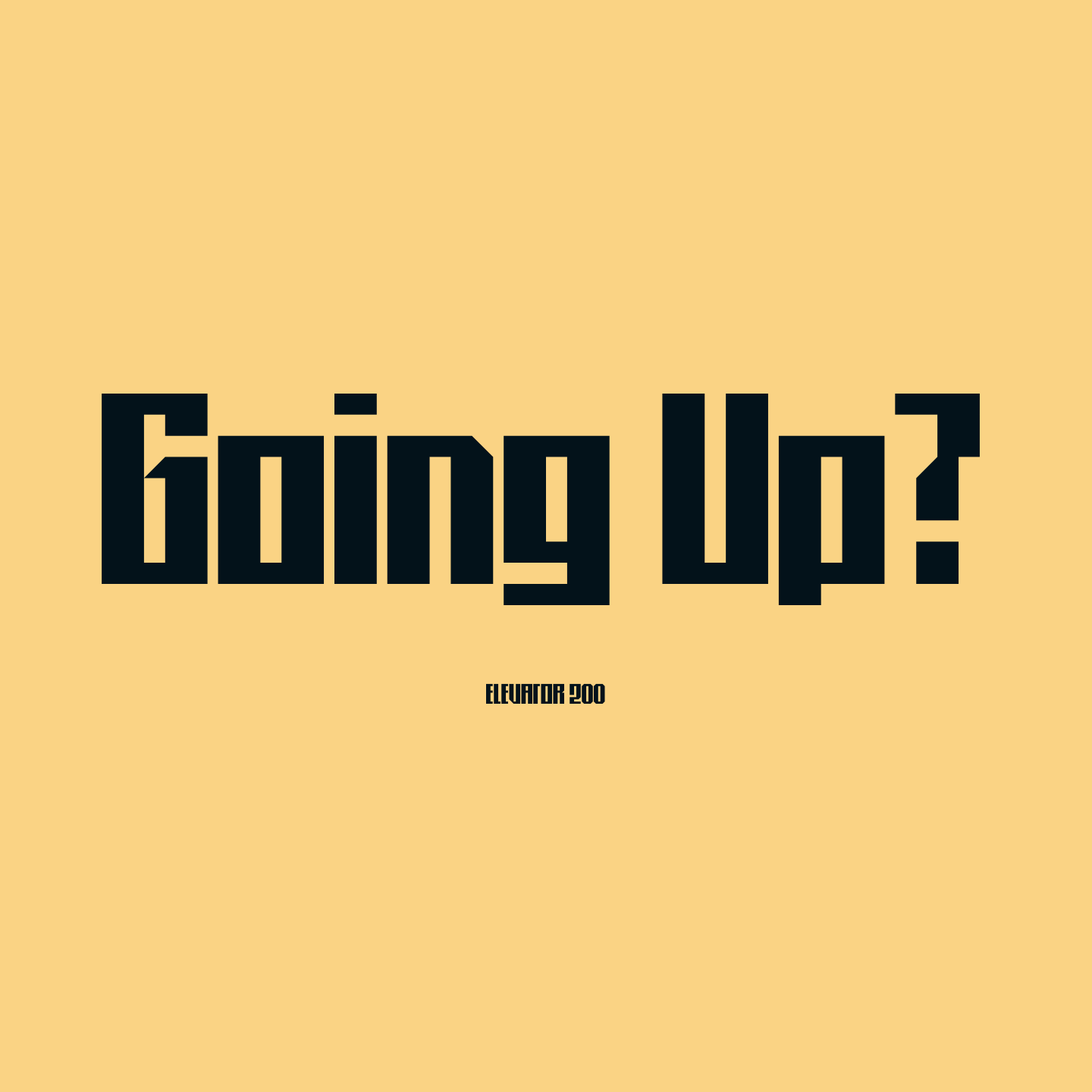
Elevator comes in two weights (or weight capacities.) Elevator 100 is the single shaft while Elevator 200 is the double.
︎ Buy Elevator at Myfonts